I recently finished reading "Don't Make Me Think" by Steve Krug. If I'm honest, this is just as much a reference for myself as sharing what I learned with you. The lessons are great and highly practical for anyone building a website. Krug works on the usability of websites - how easy a website is for a person to use - and goes deep on making it usable.
The Big Idea
Krug's first law of useability is: "Don't make me think." This means that "a Web page should be self-evident. Obvious. Self-explanatory" (p. 11). For example, "As a user, I should never have to devote a millisecond of thought to whether things are clickable—or not" (p. 15).
Reducing thinking is crucial because we don't read pages; we scan them. So you have to treat your page like a billboard on a freeway. As someone who likes to write long blog posts, that's a tough pill to swallow. But "If your audience is going to act like you're designing billboards, then design great billboards" (p. 27).
It's also important because users don't make optimal choices; we "satisfice" by choosing the first reasonable option. So, if you want a user to do something, it has to be at the top of the page and prominent.
How to Reduce Thinking
Krug gives some good ideas on making a page more obvious.
Take advantage of conventions
Links should look like links, and buttons should look like buttons, etc.
"If you're not going to use an existing Web convention, you need to be sure that what you're replacing it with either (a) is so clear and self-explanatory that there's no learning curve—so it's as good as the convention, or (b) adds so much value that it's worth a small learning curve. My recommendation: Innovate when you know you have a better idea, but take advantage of conventions when you don't" (p. 32).
This is also important for forms. The necessary part is collecting the information, not how cool it looks. Using conventional web forms helps users focus on the answers, and it also builds trust, which is required for someone to fill out a form accurately.
Create effective visual hierarchies
"A good visual hierarchy saves us work by preprocessing the page for us, organizing and prioritizing its contents in a way that we can grasp almost instantly" (p. 35).
These include big titles, noticeable subtitles, sections, and navigation.
Make it obvious what's clickable
Krug keeps hammering this throughout the book.
"In general, you'll be fine if you just stick to one color for all text links or make sure that their shape and location identify them as clickable. Just don't make silly mistakes like using the same color for links and nonclickable headings" (p. 38).
Omit Needless Words
You want to format your content to support scanning. Remember, treat it like a billboard.
"In general, you'll want to use more headings than you'd think and put more time into writing them" (p. 39). And keep paragraphs short, use bulleted lists, and highlight key terms.
"Get rid of half the words on each page, then get rid of half of what's left" (p. 49). The advice is purposely excessive. In his experience, eliminating half the words on a page is easy. Reducing it further requires you truly understand visitors' minds and see the page through their scanning eyes.
Here's an example of eliminating words:
"Your objective should always be to eliminate instructions entirely by making everything self-explanatory, or as close to it as possible. When instructions are absolutely necessary, cut them back to the bare minimum" (p. 51).
Create Context With Well Designed Navigation
One problem with websites is that there's no physical sense of space. In a store, you have signs and can physically see what's next to each other. You can quickly find food vs. clothing vs. tools. And it's reasonably straightforward to drill down another level: freezer vs. cereal vs. drinks vs. etc.
However, you don't have that same sense of direction, location, or scale with websites. So to overcome it, you want straightforward navigation.
Krug goes deep into this area:
- The logo should be upper right.
- Utility placement (sign in, help, site map, shopping cart, etc.).
- The role of search vs. menus (you want both).
Visit some bigger websites, and you'll quickly notice the conventions. Krug does have one note of warning:
"I think this is one of the most common problems in Web design (especially in larger sites): failing to give the lower-level navigation the same attention as the top. In so many sites, as soon as you get past the second level, the navigation breaks down and becomes ad hoc" (p. 73).
To overcome this problem: "It's vital to have sample pages that show the navigation for all the potential levels of the site before you start arguing about the color scheme" (p. 73).
The following insight took me by surprise:
"Designers sometimes think, "Well, we've highlighted the page name in the navigation. That's good enough." It's a tempting idea because it can save space, and it's one less element to work into the page layout, but it's not enough. You need a page name, too." (p. 75).
So you do need to omit needless words, but page titles aren't one of them.
Finally, breadcrumbs are a form of "you are here" signs. They help create context in addition to helping you navigate. This is especially important if your website goes more than a couple of layers deep.
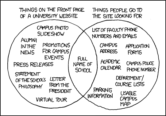
Create a Homepage For Your Visitors, Not For Yourself
Krug shares this amazing XKCD comic, which is so true it hurts.
Krug gets into the fine details of making a homepage: Where to put a tagline, how much of a welcome blub to use, and the proper use of "learn more."
"Don't feel compelled to mention every great feature, just a few of the most important ones" (p. 94).
This is another huge theme as well:
"[The Home page is] one of the most important things to test. You can't trust your own judgment about this. You need to show the Home page to people from outside your organization to tell you whether the design is getting this job done because the "main point" is the one thing nobody inside the organization will notice is missing" (p. 95).
Usability Testing Is Your Friend and Doesn't Need to Cost a Lot
Great design is complicated because there's no one correct answer. "All web users are unique and all web use is basically idiosyncratic" (p. 108)
"The point is, it's not productive to ask questions like "Do most people like pull-down menus?" The right kind of question to ask is, "Does this pull-down, with these items and this wording in this context on this page create a good experience for most people who are likely to use this site?" And there's really only one way to answer that kind of question: testing" (p. 109).
Some of Krug's thoughts on testing:
- If you want a great site, you need to test it.
- Testing one user is 100% better than testing none.
- Testing 1 user early in the project is better than testing 50 near the end.
And this doesn't have to be rocket science: "If you want to know whether something is easy enough to use, watch some people while they try to use it and note where they run into problems" (p. 115).
How Often Should You Test?
One morning a month.
You can test three users for an hour each, then debrief over lunch. The important part is to create a fixed schedule and stick with it.
How Many Users Do You Need?
"I think the ideal number of participants for each round of do-it-yourself testing is three" (p. 119).
The goal isn't to prove a point of view, but to give you actionable insights. And it's not to uncover every single problem. "You can find more problems in half a day than you can fix in a month... It's much more important to do more rounds of testing than to wring everything you can out of each round" (p. 119).
How Do You Choose Participants?
Interestingly, you don't want just domain knowledge experts. You want to cast a broad net - even people who know nothing about your industry. I liked this insight: "If 'almost anybody' can use it, your experts will be able to use it, too" (p. 121). It makes sense, but I'll admit that I didn't start there. After all, everyone starts as a beginner at some point, and you want them also to use your website.
How Do You Find Participants?
The usual places: Craigslist, Facebook, Twitter, customer forums, friends, and neighbors. A 1-hour session seems to be in the $50-$100 range. So, for $300 a month, you can get regular feedback on your website.
Where Do You Test?
You can do it in person or over Zoom. You do want to record the session so others can watch it. At Majordomo, we started with in-person testing and then switched to Zoom (with the rest of the world), and it seemed fine. It also made it easier to record since they shared their screen, and we hit the record button on our side.
What Do You Test?
It's never too early to start. Even if all you have is an idea, you can begin testing. For example, start with competitive websites to get a feel for what people like and dislike. Then move on to rough sketches, wireframes, prototypes, and finally actual pages.
The test itself is simple: get to know them (~10 minutes) and give them a set of tasks to complete (~35 minutes). For non-working pages, testers can point their fingers and explain what they would do.
Make sure the instructions are clear. Your job is to keep them focused and encourage them to think aloud.
"Don't ask them leading questions, and don't give them any clues or assistance unless they're hopelessly stuck or extremely frustrated. If they ask for help, just say something like 'What would you do if I wasn't here?' " (p. 126).
Krug provides an example session in the book to see exactly how to run a test.
Deciding What To Fix
Focus on the most serious problem first. I liked this advice: "You don't have to fix each problem perfectly or completely. You just have to do something—often just a tweak—that will take it out of the category of 'serious problem' " (p. 138).
I also liked this advice:
"Resist the impulse to add things. When it's obvious in testing that users aren't getting something, the team's first reaction is usually to add something, like an explanation or some instructions. But very often the right solution is to take something (or some things) away that are obscuring the meaning, rather than adding yet another distraction" (p. 139).
"I tell people to ignore all comments that users make about colors during a user test, unless three out of four people use a word like "puke" to describe the color scheme. Then it's worth rethinking" (p. 169).
Final Advice Roundup
Krug finishes the book with a smattering of helpful advice:
- "Know the main things that people want to do on your site and make them obvious and easy" (p. 170).
- "Be upfront about things like shipping costs, hotel daily parking fees, service outages—anything you'd rather not be upfront about" (p. 170).
- "Save me steps wherever you can" (p. 170). This is a massive advantage of the web over physical equivalents. Where can you use automation/prediction to make things easier?
- Include candid FAQs, not Questions We Wish People Would Ask.
- "Make it easy to recover from errors" (p. 171) because they will happen. Though, testing will help you eliminate the big ones.
- Apologize: "If you can't do what they want, at least let them know that you know you're inconveniencing them" (p. 171).
Recommendation
That was a bit of a firehose, but it's all good! If you're doing any website or app development or design, I'll go as far as to say this is required reading. It's highly practical advice from someone in the trenches. It's not about creating something perfect or going through an official design process. It feels human and reasonable.
If all you do is follow his usability advice, you'll be in a much better place. If you invest in regular usability testing, you'll create a great website or app.
No comments:
Post a Comment