I regularly get calls from MBA grad students with a similar situation: "I took a few data science classes, love it, and want to get a job doing data science. However, my resume doesn't show much, if any, related experience. How do I get a job doing data science?"
It's a great question, and it makes sense why they'd call me. I was in that exact position when I graduated. The only difference was at the time the term "data science" didn't exist and tools were still in their infancy (Google had just bought Youtube, and we were all still wondering if this "video upload" site thing was viable).
In 2010 I wrote about a general post about finding a job, which is still relevant, and here's my specific answer to aspiring data scientists.
1. Define Your Talents
The Talents
Data science, like Marketing and HR, is a broad term with many jobs and skills within. So when you tell me, a person looking to hire data scientists, you want to be a data scientist, I'm still not sure what you mean. To which I usually follow up with the profound question of, "What does that mean to you?" I typically get a bland response simply because they're still discovering what it all means themselves. Here's some guidance:First, decide if you're going to be a specialist or semi-generalist. A specialist is easy: focus on one thing and be the best in the world at it. Get amazing at producing accurate forecasts. Become THE data cleaning person. A warning: you'll be competing against PhDs in this space.
My recommendation is to go down the semi-generalist path. Find an interesting combination of skills/interests that's helpful. You're good at project management AND forecasting? That's interesting. You crunch numbers AND can give a presentation to executives? Now you have my attention.
HBR wrote a fantastic article called Data Science and the Art of Persuasion, and I recommend reading it at least once. It breaks data science into six talents. In brief, here they are:
- Project management: do you know agile/scrum project management? Can you be an effective scrum master and get product owners to define done and prioritize?
- Data wrangling: can you find, clean, and structure data? Are you good at automating processes?
- Data analysis: can you find meaning in data and apply it to a business question?
- Subject expertise: what business model or industry are you interested in?
- Design: are you good at data visualization? There's the technical side, but also the art side of it.
- Storytelling: Can you write a narrative around the data and analysis? In my experience, this is the weakest talent on a data science team.
The People
If you read that list and still aren't sure, go talk to people. Actually, no matter what, go talk to people. Informational interviews are amazing. It's the lowest risk way to learn about something (which, if you messaged me to chat, and I asked to you read this first, and you are right now... good! keep going!).Find other data scientists. Find people who work with data scientists. Find people who work in data-intensive industries.
I go into more depth in my original post, but here's the high level: come up with a set of questions to ask everyone. You may not ask all of them, but having a pre-set list will give you the confidence to reach out because you're prepared. Talk to at least 12 people, more if you can swing it. I talked to 2-3 per week while in school.
The Companies
My observation is there are three types of companies. They all have pros and cons. After talking with people and evaluating your talents, one of these types of companies may attract you.Large companies, especially in data-driven industries, typically have a dedicated data science team (though the name might be different). Or, at least a specific role dedicated to data analysis. All fortune 500, if not 5,000 have this setup. These types of jobs tend to have narrow scopes. For example, my job at HP is to forecast how much money HP will make selling ink. Very specific. I use all 6 talents to do it, but my scope is narrow.
Small to medium size companies will have a small marketing team, but no data scientists. In my opinion, these are interesting positions. You don't need to be the best analyst in the world, but you can bring your skills and add a lot of value to the original position. For example, my internship was with a 500-person credit union. My job was to create a new checking account offering. I did competitive research, ran a survey... and did an analysis on their customer database. Nobody else on the team knew how to access this fantastic resource! Granted, I had to figure out how to get access and build my own tools (data wrangling), but I was OK with that. It was like I had superpowers relative to the rest of the team. The pay is typically less, but the variety is more, and the expectations are lower. This could be a perfect first step.
Boutique analysis consultants are super small, 1-5 people, companies that specialize 100% on data analytics. Like a typical consultant, they come into a company, learn about their problem, and do an analysis on behalf of the company. These are harder to get into, but you can learn a ton as an apprentice in a short amount of time. Be willing to do the grunt work for long hours.
You think you know what you want to do, or at least have a plan to figure it out? Great! Let's move on.
2. Cultivate Your Talents Into Skills
"The separation of talent and skill is one of the greatest misunderstood concepts for people who are trying to excel, who have dreams, who want to do things. Talent you have naturally. Skill is only developed by hours and hours and hours of beating on your craft." - Will SmithThe lack of experience on your resume is tough. Unfortunately, there's no shortcut. To get the experience, you actually need to practice data science. The good news is you don't need a job to "beat on your craft". There's almost an unlimited amount of data thanks to the internet. Pick a subject, find some data, and do an analysis.
FiveThirtyEight has its own dataset and often points to its original sources within an article. Sports data is interesting, so is political/polling data. There's census data, economic data, Zillow home sales data, stock market data, and so much more! There's data specific to an industry you're interested in. Collect your own data!
I tend to collect my own data and pick ones relevant to my life.
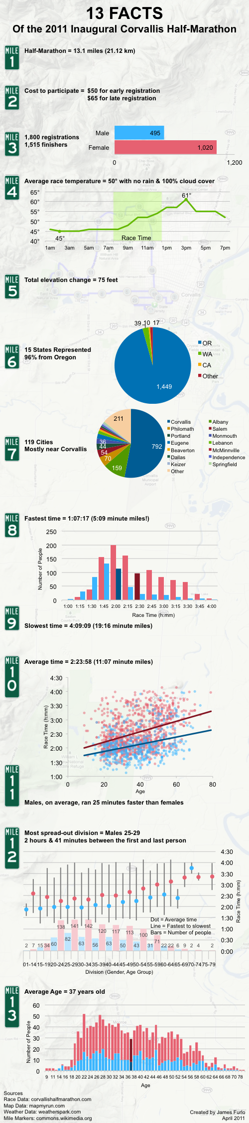
- I ran a half marathon, and they posted the results online. So I turned it into an infographic. I'm particularly fond of this one.
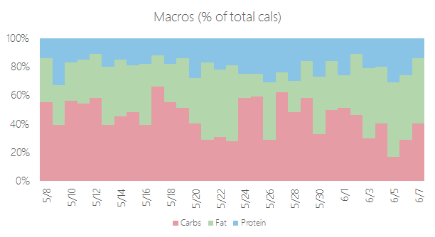
- I tracked my steps, weight, and food. Then I analyzed it and shared what I found.
- I created a map of real estate sales in my area. I thought this was particularly cool.
- I gave a transparent look at our investment property's performance. I still get calls about this one.
- I tracked my steps
- I tracked more steps
- I found out I could copy and paste my iTunes library into Excel. So I had fun with it.
- While visiting family in Port Townsend, I learned they get less rain than we do. So I found weather data and wrote a post about it.
- A random one about the US Government.
- A follow up to a podcast topic about PC vs. tablet shipments.
- Once I even did a couple of posts about my personal finances.
- I also did some tutorials, like a DIY loan calculator.
Can you guess my talents? I like the design and storytelling side. I'm much lighter on the technical data analysis and data wrangling parts.
If I were looking to get a job, I would do at least one per week. Beat on your craft to hone your skills and gain experience. We'll talk about what to do with all this effort next.
There is one more way to gain experience: [pro-bono] freelance work. There are a bunch of small businesses and organizations that would love help analyzing their data, but they don't know how to do it (like my credit union example), and often times they can't afford to hire someone to do it. This is an opportunity!
For example, I talk to contractors and landlords all the time who would LOVE to create an annual budget but don't really know how to go about it. Volunteer to take a look and help. I created a forecasting tool in R for my church to better predict giving trends. I worked with a local broker to create a "state of the real estate market" report he could share with clients. It didn't pay much, but it led to future projects. In fact, don't do it to get paid. Do it to help, and then add it to your resume.
Another interesting option for freelance work is to signup for Upwork. It's a website that companies go to for one-time projects and/or part-time work. Often times it's remote. I've hired 4 people from the site, and it's fantastic. Tip: I've noticed that data scientists call themselves a "financial analyst" on the site. If anything, it'll give you interviewing experience.
Got a plan in place to cultivate your talents? Let's show it off.
3. Showcase Your Skills
In the graphic design world, people have portfolios. In the software development world, people have gits. But they're the same thing: a way to showcase your work. As a data scientist, you want to create the same thing.Think about it from an employer perspective: I'm about to take a considerable risk, financially and culturally, to bring someone into my organization. I want to reduce as much uncertainty as possible. That's why employers rely so heavily on recommendations and another reason why informational interviews are so important.
Reading accomplishments on a resume are helpful, but reduce my risk a lot and SHOW me what you did. That's why designers have portfolios. I don't care what school you went to, I want to see for myself you know how to draw.
So, create a WordPress site and find a theme that works for you. Or whatever tool you want - don't overthink this. Upload your projects to Google Drive and share the folder. It's not as pretty, but I'm not evaluating you on how pretty it is.
Then, as you do projects, add it to your website. Start with every. Single. Homework. Assignment. At this point in the game, you need volume, you can add a featured section later. But don't just post the homework, take one more step that'll blow everyone out of the water: create a short video where you walk through what you did. Wrote some R code? Use Zoom to share your screen and talk through it. Embed the video using Youtube (it turns out it was viable) along with the code. Or put the code in Github and link to it.
Did you have a final project with a presentation? Record yourself giving the presentation (do it again by yourself if the presentation came and went). Then record again showing the actual analysis. Show your work. For group projects point out the work you did.
I use video all the time, and it's fantastic. When I make an offer on a property, I don't just kick over the offer and hope the seller can figure out my thinking. I record a quick video on Zoom, upload it to Youtube and share it with the document. I get comments all the time about how professional it looks. You should do the same thing. I personally choose to keep the video on so they can see me and my expressions, but you don't have to. This is especially important if your talent is storytelling.
I made a sample presentation so you can see exactly what I'm talking about. Mine was done off the cuff. In reality, I'd script out what I wanted to say a lot more... and slow down my talking. Anyways, here it is:
You can also make tutorials. You can comment on other people's work. Flowing Data is a perfect example of these types of posts. So is Edward Tufte's Twitter account. If you do the commentary, go further than they do. Go into detail on what's good and bad.
Then put the link to your portfolio on your resume.
When following up after an informational interview, you might mention a project you did, share the link, and ask for their feedback on how to make it better. Then... follow their advice to improve it.
4. The Briefcase Technique
If you do this, you'll get interviews. Now it's time to knock it out of the park. Part of the interview preparation process is researching the company. Take it one step further and do an analysis for the company. The closer you can get to what you'll actually be working on, the better. If you interview for me, look for IDC data on printers. If you can't do that, look at HP's historical revenue.Imagine being able to say, "I was looking at IDC shipment sales, and I found that the market is shrinking. Here, let me show you. (take a paper with a chart out of a briefcase, or portfolio, whatever). I noticed X Y Z... And a question." Or, "It looks like HP is under-represented in the copier space. I recommend investing more there." Or, "why isn't HP in the copier space?"
I learned about this technique for freelancing from Ramit Sethi, but it works just as well when interviewing for a data science job (hint: it actually works for all positions).
Look, you're probably not going to teach me something or uncover some new insight. That's not the point! Your goal is to show me you care, to show off your skills, and to demonstrate you're going to take the extra step of a top performer.
Final Thoughts
I know what I'm suggesting is a lot of work, but the results will be worth it. Plus, it's a low-risk way for you to discover if you genuinely like data science without having to commit to a job to find out.Good luck with your job search!
Photo by Carlos Muza on Unsplash